Introduction
The history of Australia and its architecture are intimately related, with many movements exhibiting the same events and characteristics. The nation’s colonial heritage made the United Kingdom’s impact on the state’s early building initiatives inevitable. Economic growth was starting to stabilize at the start of the 20th century, offering the nation a justification for enhancing its cities (Walker, & Burns, 2018). However, the British architectural companies with offices in Australia were hesitant to provide the emerging nation with the same level of quality and attention to detail demanded in the United Kingdom. Melbourne is ranked the second-largest city in Australia based on its architecture. The city offers a comprehensive design development of both modern and historical buildings.
Most residential architecture is found in the suburbs and has been appropriately influenced by a long and rich history. The expressionist tendencies of Kevin Borland, Griffins and Edmond, and Corrigan are discussed within the paper against the mainstream pluralism in the architecture of Melbourne city (Lochhead, 1999). Early Melbourne features Australian colonial cities, with dotted houses visible through Hoddle’s street grid patterns. In two iron buildings in Melbourne’s Southern area, the researcher has estimated and shown several prefabricated housing solutions (Beeston, & Matarredona, 2014). Detailed analysis of the city’s architecture is done with the expressionism concept, where the artists seek to depict real images of one from a segregated area. The Australian region depicts work from German artists.
This architectural revolution often begins during World War I with the architects of the medieval era. The Canberra architecture and associated Canberra drawings were mirrored in the Griffin architecture (McDougall, & Corrigan, 2003). Griffin’s design was entirely distinct from that of any other professional architect. Griffin employs geometric shapes like the dome, triangle, and many more manifestations. Although the architect was fully realized in Canberra, Australia, its design was compared to that of the United States. Edmond and Corrigan’s concept uses methods associated with bright polychrome bricks. The style was entirely conventional and had several advantages, including better use of space.
Criticism of Griffins’ Contribution to Architecture
With a pyramidal top, W.B. Griffin delineated the odd design of Giurgola’s Parliament House. It was felt that the flag’s construction was awkward, troublesome, and redundant. The enormous Canberra was an odd construction that was technically perfect and open to separation, but it lacked the resemblance of the original and experimental. The Griffins created the Capitol in the Molonglo Valley, and it is the most stunning and mysterious architectural concept of the Griffins that was given the physical shape. According to M. Griffin’s analysis of the federal capital competition, the designs were more interesting and hopeful than the rest of Canberra’s built environment (Walker, & Burns, 2018). As a student and an architecture specialist, the artist reasoned a significant rearrangement of the societal forces and politics in the United States of America.
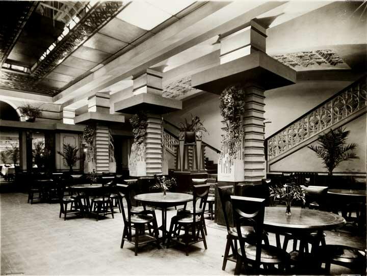
The Griffins’ household architecture served as a shield against social conflict and contradiction in particular bourgeois culture. The artist-architect who dominates bourgeois culture became the owner’s alter ego and developed a negative attachment to their work. Walter Burley Griffin was commissioned in 1915 to rebuild Melbourne’s Vienna Cafe. The location was reopened as Cafe Australia in 1916. With its entirely redesigned façade and interior, the new version’s design differed from the original. The café was defined as “hyper-modernistic,” “bizarre,” and “somber” by the magazine that saw it after it opened. Its furnishings were also noted as “old-fashioned” and “somber.” The architect’s usage of the Chicago School and European Art Noveau mixed modernistic elements with casual touches to create a café with a vaulted ceiling, hidden cove lighting, and lace embellishments.

To commemorate the passing anniversaries of W. B. Griffin and M. M. Griffin, Transition published three papers on the architecture of the Griffins. On a social and political level, Griffins and their architecture cannot be viewed as modernists but as avant-garde. They had little understood of nationality, and their architecture was restricted to the physically dominant local patronage system, voluntary associations, and artistic groups (Walker, & Burns, 2018). Due to their dedication to post-confederation nationalism, Griffins and their architecture were primarily at odds with European Modernism. The social and political situations that Griffins saw caught them off guard. The primary challenge of accepting the abstraction, the mechanism, and the production process was at odds with the Art and Craft’s continuous sloppy connections (Lochhead, 1999). It was hard to elucidate the democratic notions since the concepts were so ambiguous and vague. The experimental, highly artistic, and abstract architecture that Griffin practiced was their guiding philosophy.
Their single design tenet led to the incorporation of their rough-hewn brickwork, crystallized structural parts, and ornamental elements in their building. The underlying archetypes of the temple, cave, and redoubt were what Griffin sought to reverse. The abstraction threatened the bourgeois society by bringing it closer to the reality of factory production. An anti-modern aesthetic was developing to support the increasing orthodoxy of the new corporatism in America (Lewi, 2018). The Canberra drawings that assisted the Griffins in figuring out how to counter this creative attempt to preserve the atmosphere of Arthurian responsibility for the town sparked their reaction. The anti-modern impulsive character was further developed in M. M. Griffin’s planned home, and it was eventually sublimated in the design of Newman College.
Griffin’s philosophy may be succinctly summed up as opposed to the anti-modern aesthetic they presented to Australia. They could not gain the approval they needed inside the bourgeois social structure due to their social and political aspirations. Griffin’s description of Canberra’s architecture revealed an odd distortion of its significance and cunning. Strange facial expressions and stillness accompany uncertain communications. Canberra exudes a troubled and worn-out atmosphere brought on by a pattern of obsessive lapses. Habermas had seen the Griffin architecture as the degeneration of the collective propagandistic collective art or into the commercialized collective culture. The majority of the Griffins’ architectural structures have suffered this fate.
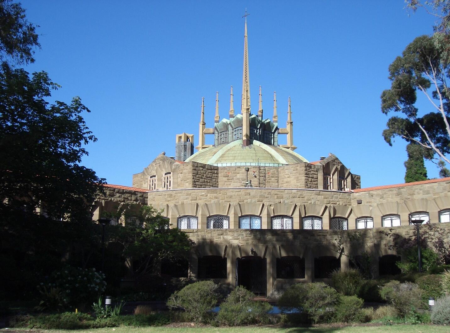
One of the architects’ most notable achievements is still the following project. The Griffins also created the previously mentioned restaurant and the structures at Newman College. The architect set aside a sizable area for leisure since the site resembled a meadow more closely than an urban plot of land, thanks to the University of Melbourne’s allocation of a sizable area for the college to be erected (Lewi, 2018). The final design includes two sizable rotunda-shaped structures, one for the dining hall and the other for the library. The location of these buildings was on the opposing sides of the area’s edge. Long student room wings, one for men and one for women, joined the buildings. The college chapel was positioned between them, blocking access to the open space.
As was evident in the preceding paragraphs, the Griffins’ contribution to Melbourne’s architecture did not follow the rules of a certain style, as would occasionally be anticipated by the movement’s supporters. The designers used a variety of approaches to integrating elements from classic and modern schools in their creations. As a result, the pair tried to combine various concepts and produce projects significantly different from the trends prevalent at the time; despite arriving in Australia later than it did in the UK and the US, the trend toward employing materials like metal and glass nevertheless took hold in the nation (Johnson, 2002). The Griffins, however, experimented with various materials and designs, fusing more contemporary shapes with natural materials and elaborate ornamentation. It may be inferred that the architects’ strategy was going against the cultural expectation that just one set of guidelines—a standard for adhering to one style—should be used when designing a design. Instead, the Griffins combined new and ancient elements to produce projects that were distinctive and simple to differentiate.

Contribution of Edmond and Corrigan to Architecture
Edmond and Corrigan were in favor of developing architecture in unconventional methods. They meticulously constructed architectural structures using non-traditional polychromic brickwork. These bright polychromic bricks give off a unique appearance from typical building materials (Vernon, 2006). The use of brilliantly painted or colored bricks was common throughout medieval Europe. The protestant restructuring in the iconoclast periods sometimes resulted in the pale washing or destruction of these kinds of bricks (Van Acker, 2018). Australia’s self-conception differs from the real perspective due to the tremendous influence of the squatter romantics on Edmond and Corrigan’s architecture. Conrad Hamann recorded and recalled the formal building of the Edmond and Corrigan designs in his book “Cities of Hope.” The stage design is displayed on one side, while the design’s architecture is displayed on the other.
In 1975, when various designs were developing in the market, the architectural concept in Australia was shifting. Due to a lack of creativity, most of Melbourne’s architecture, it was claimed, relied on the conventional and theoretical approach (Vernon, 2006). Edmond and Corrigan created a novel approach to architectural design during that period. The new style stood out from the competition and was connected to both designers (Malcolm, 2009). Each designer puts their unique spin on their creation. Traditional Australian architecture was moving in a certain direction at the time. As a result, every building had an almost identical design, and the exterior was starting to seem rather boring.
On the other hand, some historians claim that Edmond and Corrigan both had the initiative to develop a difference in the method to modify the pattern and the design looks. The two architects’ designs altered the scope of Australian fashion (Van Schaik, 2013). They are forced to take an expressionist viewpoint to depart from conventional architectural design. They immediately gained approval because the construction’s concept and goal influenced their design.
Since there was no specific material linked with the fundamental portion of the construction design, previous designers used those materials in their construction to give it a sophisticated finish. However, Edmond and Corrigan distinguished themselves by deciding on a distinctive material to create the outside surface of their tower (Goad, 2022). The architect chooses polychrome brick for the outside surface because it has a beautiful, rough texture. One may argue that the expressionist approach to design is more popular, and many church administrations have charged them with creating a church that would influence the congregation. Both designers strive to make sense of the design as it pertains to the construction purpose while running their company, maintaining the unique design, and expressing individuality. Since they were adopting such designs that fit many objects in a short space, Melbourne’s city center and other constructions were essential (Goad, 2022). Therefore, one of the key differences from others was the modernizing of the architecture. To further this argument, it has been asserted that conventional architects seldom place a strong emphasis on the efficient use of space, but Edmond and Corrigan did so in tandem with traditional design (Evans, 2005). As a result, their design had a very high level of approval at the time. They always strive to fit many items into the smallest feasible area since that’s what current times need.

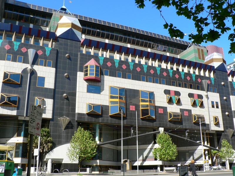
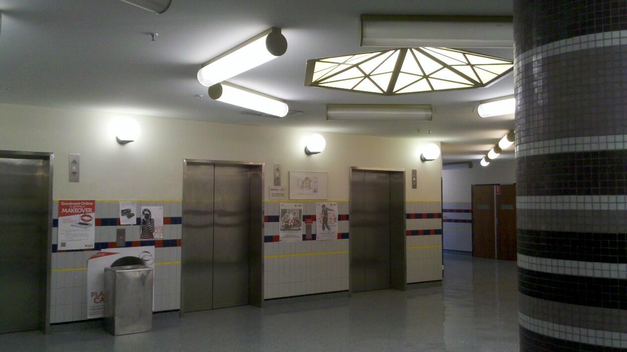
While the architects produced many extremely distinctive and original works, one of the most illustrious ones is the RMIT Building 8 portion of RMIT University. In 1993, this project was finished. It is a prime example of postmodernism, while the architects claim that regional culture also had a significant impact (Tan et al., 2022). The building’s exterior is made of vividly colored stones and includes pieces of varied forms, exposed pipes, and architectural elements. Additionally, the windows on its front and back facades are multicolored. In addition to being less organized, the interior has a more complicated arrangement. Some rooms have taller ceilings than others, some of which span multiple stories (Frichot et al., 2012). The interior’s general structure is rather haphazard, keeping with the firm’s past work and the postmodern design aesthetic. It should be noted that both the inside and exterior are vivid and packed with features and forms. For instance, the lobby’s lighting mimics the layout’s hexagonal design.
The architects made deliberate architectural decisions for the facade. The structure displays Melbourne’s cultural heritage and historical characteristics. Because of its depiction of city life, it is sometimes referred to as the “city in a building (Tan et al., 2022).” For instance, the windows’ golden frames are reminiscent of earlier campuses’ gothic architecture. The architects’ own words serve as a visual representation of their identity search. Corrigan asserts that political influence can always be seen in architectural design (Njoo, 2008). As a result, the choices taken by the designers are a clear indication of their political and ideological opposition to the recognized norms of architecture, i.e., the standards and principles indicated by styles and schools. The architect adds that expression may be more crucial than perfection in some projects.
This illustration of how local culture has affected architectural evolution shows how interested architects are in Melbourne’s cultural identity. It may also be seen as a response to the growing tendency of skyscraper construction that developed once contemporary office buildings were introduced to Australian cities. Although their development was not stopped, the city acquired many designs with vastly different external and inner layouts. Glass, metal, and monotone colors replaced colorful stones and windows with gold trim (Shafer, 2022). The architects’ use of various vivid colors distinguishes their creations from other structures. These decisions convey feelings and individual attitudes about the city’s pre-existing architecture, providing the contrast required to demonstrate Australia’s plurality as a whole.

Corrigan and Edmond were recognized among the Melbourne architecture forefront influencers mostly in the post-modern architecture. The approach that they gave in the postmodernist framework shown in their architectural work in the interest of public engagement and building ability to adapt the ever-evolving styles and complexities. Edmond and Corrigan worked to make architectural designs that were aware of the surroundings in which they were made as they forged a new route for postmodernism in Australia (Putra, 2018). They took inspiration for the Church of the Resurrection’s blueprints from their impression of previous Australian home design.
As a result, Edmond and Corrigan leaned on a sense of previous Australian suburban architecture throughout the design of the “House of the Resurrection” in order to conjure a familiar impression of the Australian design. The Home of the Resurrection’s designs may be categorically described as a classic Australian house design when looking at the building’s architectural blueprints (Day, & Raisbeck, 2021). The big assembly would frequently spill out onto the vestibule and veranda; thus, such a purposeful and inventive design method allowed the space to quickly accommodate the multitude and a diversity of activities. The structure’s adaptable open layout, which allowed it to serve as both a building and a church hall, is an illustration of Edmond and Corrigan’s creative design thinking, which they used to create links between spaces that welcome the involvement of their users.
The said building was groundbreaking for the field of architecture due to its use of common suburban materials like wire-cut orange and brown manganese bricks, generous daylighting that gave it the feel of a community house, typical bay windows, parapets, and downpipes, and strong contextual ties to the surrounding suburbs (Day, & Raisbeck, 2021). Instead of the anticipated gothic church style, the structure was a prominent representation of Melbourne suburbia. The concept is envisioned as a dramatic break from the previous design settings because of the structures’ openness and regular widows, which offer an ultimate allusion of a communal building while on the similar side of Melbourne architecture.
The school Preshill was rebuilt by the two architects using its intricate architecture, uneven angles, and regular design. Beams and unfinished wood were used to construct every building at the school. Sliding glass doors and clerestory windows were employed in the rooms. By partitioning the inside area using folding doors, it may be utilized for a variety of functions. There were other little rooms adjacent to the main area where youngsters could play on high platforms (Duncan, 1980). The Margaret Lyttle Memorial School’s School Hall, located in Australia, is seen in the figure above. Regarding the information included in an architectural proposal for a location in Australia, the researcher has calculated and altered several intellectual tactics.
Conclusion
The overall theme of Melbourne architecture with the expressionist inclinations of three people—Griffins, Kevin Borland, and Edmond & Corrigan—serves as the conclusion to this task (a rebellion). In relation to the content of Australian architecture, the researcher has covered a number of manipulation and strategy topics. The researcher covered both the critique of the Griffins’ contribution to architecture and the critique of Edmond and Corrigan’s contribution to architecture. The growing orthodoxy of the new corporatism in America was being bolstered by an anti-modern aesthetic. Because their design was influenced by the construction’s concept and purpose, they were approved right away. It is simple to infer and demonstrate that Kelvin Borland was a renowned educator and creator of quality and innovation.
The aforementioned examples of structures and designs show how architects have chosen to follow their ideologies rather than broader movements and trends. The Griffins’ ambition to complement nature and their goal to integrate old and modern standards in their undertakings led to works that defied established stylistic norms. Even though many of the structures were destroyed, their contribution to the city’s architecture can still be seen in several projects. However, certain structures still display the fusion of modern concepts and historical movements. Borland’s works show a movement from the conventional to the brutal, shifting the alignment from adhering to a certain school of thought to adding knowledge and experience to producing more potent pieces. Although Borland’s work complies with the rules of the style, the architect was able to use materials and shapes that were particular to his vision. As a result, the juxtaposition of raw natural materials and exposed concrete gave the city’s architecture a fresh accent and rebelled against the clean and secure modernism that was then in vogue.
Finally, the designs of Edmond and Corrigan are a blatant illustration of the author’s dissatisfaction with mainstream and unimaginative conventional modernism. Instead, in an effort to portray a vision of a modern and enhanced design that also embraces the city’s past, the architects make an effort to employ colors and textures that are notably different from those that are often used. The political message these designs send—that the value of monochrome structures with a straightforward plan has no emotional or cultural significance to Australia and Melbourne—is evident in the expressionism of their forms. As a result, such structures serve no purpose and cannot convey the city’s character or history. On the other hand, the less traditional and more expressive structures exhibit distinctive national characteristics and convey the multiculturalism of Melbourne and Australia as a whole.
References
Beeston, R., & Matarredona, N. (2014). Adapting vernacular architecture: The case of the Singapore Cottage in Melbourne: R. Beeston N. Matarredona Desantes. In Vernacular Architecture: Towards a Sustainable Future (pp. 143-148). CRC Press.
Borland, H. C., & Hamann, C. (2006). Kevin Borland: Architecture from the heart (Vol. 2). RMIT Publishing.
Day, K., & Raisbeck, P. (2021). The last laugh and its afterlife: Emerging narratives in 1970s Melbourne architecture. Fabrications, 31(3), 336-356.
Duncan, J. (1980). Art nouveau exhibition: Art nouveau architecture in Melbourne-catalogue introduction. Historic Environment, 1(1), 8-11.
Evans, D. (2005). The Changing of the Guard: The social and cultural reflections of community in 1970s Melbourne architecture. Fabrications, 15(1), 39-53.
Frichot, H., Preston, J., Spooner, M., Pickersgill, S., Kovar, Z., Hann, C., & Evans, M. (2012). An antipodean imaginary for architecture+ philosophy: Ficto-critical approaches to design practice research. Footprint, 69-96.
Goad, P. (2022). “Making something out of nothing”: The architecture of Sean Godsell. Architecture Australia, 111(3), 87-89.
Johnson, D. L. (2002). Australian architecture 1901-51: Sources of modernism.
Lewi, H. (2018). Putting architecture on show: Two recent exhibitions in Victoria, Australia. Fabrications, 28(1), 113-117.
Lochhead, I. (1999). Beyond architecture: Marion Mahony and Walter Burley Griffin-America, Australia, India.
Malcolm, E. (2009). Australian asylum architecture through German eyes: Kew, Melbourne, 1867. Health and History, 11(1), 46-64.
McDougall, I., & Corrigan, P. (2003). Sunshine on the valiant [The AS Hook Address delivered at Storey Hall, RMIT, on 29 Aug 2003 by Peter Corrigan and a tribute to Corrigan by Ian McDougall.]. Architecture Australia, 92(6), 84-87.
Njoo, A. (2008). Organic Architecture: Its origin, development and impact on mid 20th century Melbourne architecture (Doctoral dissertation, RMIT University). Web.
Putra, Y. (2018). Chapter six the architect’s drawing in the postmodern era Yvette Putra. Art and Design: History, Theory, Practice, 95.
Shafer, S. (2022). Paradoxes and paradigm shifts in the utopic desire for high-rise housing in Melburne and Suffers Paradise, Australia between 1945-2005 (Doctoral dissertation, University of Melbourne).
Tan, H. A., Harrison, L., Nelson, J., Lokic, M., Rayner, J. P., Threlfall, C. G.,… & Williams, N. S. (2022). Designing and managing biodiverse streetscapes: Key lessons from the City of Melbourne. Urban Ecosystems, 25(3), 733-740.
Van Acker, W. (2018). Peter Corrigan, the Bodgie Wolf, and Other Larrikin Tygers of Wrath. Fabrications, 28(1), 3-24.
van Schaik, L. (2013). Differentiation in vital practice: An analysis using RMIT University of Technology and Design interfaces with architects. Architectural Design, 83(1), 106-113.
Vernon, C. (2006). Canberra: Where landscape is pre-eminent. In Planning twentieth century capital cities (pp. 146-165). Routledge.
Walker, P., & Burns, K. (2018). Constructing Australian Architecture for International Audiences: Regionalism, Postmodernism, and the Design Arts Board 1980–1988. Fabrications, 28(1), 25-46.
